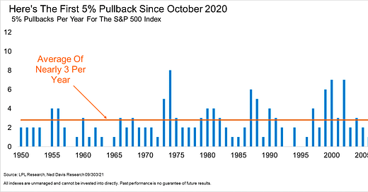
The S&P 500 Index closed the month of September down -4.7%. The first down month for the benchmark US stock index all year. To couple September’s decline, investors witnessed the year’s first 5% drawdown from an all-time high. Since 1950, the S&P 500 averages 3 pullbacks of that magnitude per year. In other words, the price action we saw in September is completely normal and dare I say healthy. We’ve seen diverging breadth data for months, with fewer and fewer stocks participating, the average stock has done nothing since mid-June, and the rate of change in yields is putting pressure on mega-cap names. We shouldn’t be surprised that during a seasonally weak period, cap weighted indices closed the month lower.
Speaking of seasonality, check out the below from my friend’s at Topdown Charts. Q4 is a seasonally strong period for stocks, the below displays the average daily return of the S&P 500 from 1990-2019, overlayed with 2021’s current price path. I think it’s safe to say, this is a feather in the cap of stock market bulls anticipating higher equity prices by year end.
The newswire has been ripe with apocalyptical headlines as of late. From comparing Evergrande to the fall of Lehman, to the irrational worry over the US debt ceiling. If you solely paid attention to financial news headlines, unaware of stock prices, you’d assume the current drawdown is much worse than -5%. This is a unique market. Analysts and money managers will disagree over which variables to pay attention to. Is it inflation data? COVID cases? Microeconomic surveys? Earnings growth? The list goes on. Sure, some have been academically and statistically proven to carry more weight than others. But at the end of the day, price is the only thing that pays.
What’s changed this past month, from purely a price perspective, that is worth noting?
Rate of Change in US 10yr Yield
5-day Rate of Change reached the highest level since February
Deep Value outperforming the traditional value factor
Big broad market implications for this chart. The cyclicals trade came back alive in September. If Value is outperforming, it’s tough to anticipate an environment where smallcaps aren’t leading largecaps. Both of the below ratio charts are trading at significant levels.
Inflation charts turning up!
One thing “deflationists” could hang their hat on, was that breakevens and other daily inflation gauges were much more tame than what we’ve witnessed from CPI or PCE inflation data. Charts like Energy vs. Utilities or Transports vs. Utilities appeared to be rolling over in August, but are now making their way to new highs. This is extremely notable in my opinion. Inflationary forces will alter the landscape of risk assets and their relationship to one another in a powerful way.
My main takeaway from September, is to remain patient and diligent in our evaluation of the equity market. One month is a very long time in the stock market. Be comfortable challenging your core thesis - if you are wrong, price will surely let you know!
That’s enough out of me.
SM


👍