Not Another Post About Breadth
Over the past few weeks, technicians have done a spectacular job pointing out the multitude of data-points running counter to index price action. Whether it’s NYSE new highs, S&P 500 stocks above their 50 day moving average, NYSE upside volume, or equal-weighted vs. cap-weighted; it is no secret that breadth is deteriorating. Check out the below from my friends at Topdown Charts. It’s a chart of the MSCI All Country World Index and the percentage of countries trading above their 50 day moving average. This highlights that bad breadth isn’t just a US story, it’s a global one. Equities as an asset class are displaying a decline in participation, which may or may not foreshadow a reversal in the indices.
So what does this mean for your portfolio? Well, back in March it was noted that adding to quality growth was a prudent decision and that chasing the reflation trade (smallcaps + value) was not in the best interest of long-term investors. For the past 2 months it’s been all about quality, growth, and mega-cap leadership. S&P 500 Growth is outperforming S&P 500 Value year-to-date by almost 100bps. It’s not much, but it goes to show that the spread between these two factors has reversed completely. I mean on May 31st, S&P 500 Value was outperforming Growth by nearly 10.4%. Less than 2 months later and we’re seeing Growth completely close the gap and regain leadership…
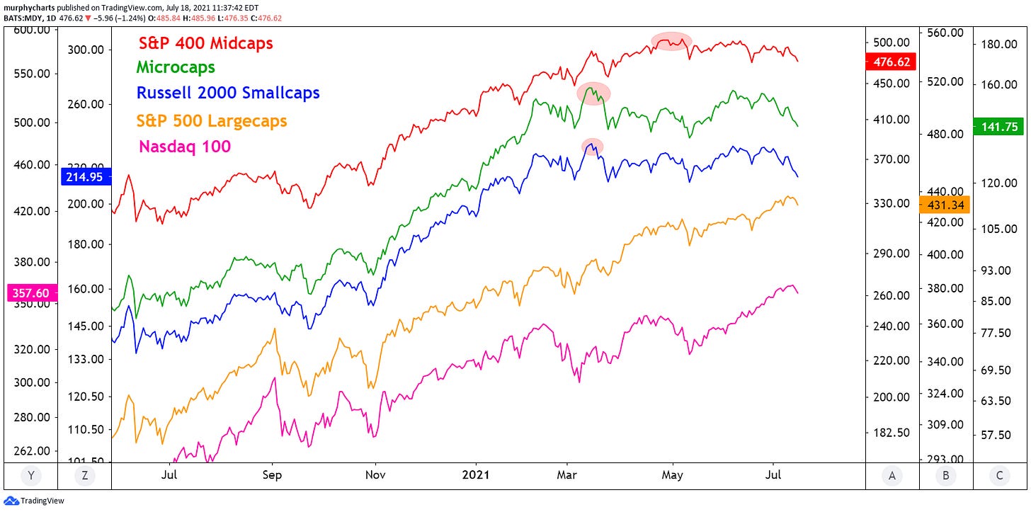
The below chart is a simple illustration of the type of environment we’ve seen over the past few months. In mid-March, microcaps and smallcaps printed their most recent all-time highs and in May, the midcaps followed suit. Since then, mega/largecaps have taken over. Performing extremely well on both an absolute and relative basis.
Thus far in Q3, the yield curve continues to flatten by way of longer-term rates falling faster than short-term rates. 10’s-2’s are back trading to where we found them in February of this year.

This has aided longer-dated bonds and boosted mega-cap technology names. Below is a chart of the 20+ year Bond Index overlayed with US Mega Cap TR Index relative to the US Total Market TR Index. I think this chart is very important. If we continue to see the yield curve flatten, signaling late-cycle economic strength, I don’t believe we should be concerned with rates negatively impacting growth/megacap stocks. Economic slowdown + inflationary pressure is a dangerous mix, especially if said slowdown leads to a full on recession. But supply/demand forces within the bond market, are not signaling an inflationary threat. Quite the opposite...for now.
Whether or not the bond market has simply priced in future tightening and the path of least resistance for rates is in fact higher, I couldn’t tell you. I do know that the long bond continues to form new highs and megacap stocks are outperforming the broad market. I have and always will place more weight on price.
That’s enough out of me.
SM


