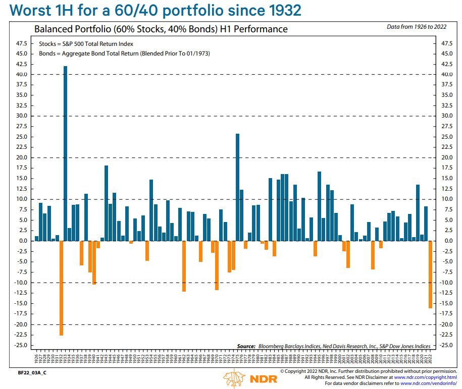
1H ‘22 marked the worst 1H for the 60/40 portfolio since 1932.
The 10-year US Treasury Note Yield started the year at 1.51%, closed H1 at 2.97%.
The avg. US 30-year Mortgage Rate started the year at 3.10%, closed H1 at 5.70%.
Despite the S&P 500 Index seeing positive earnings growth, stocks declined due to multiple contraction associated with rising interest rates and fear of persistent inflation.
Stocks down, bonds down… If your portfolio lacked exposure to cash, commodities or other alternative asset strategies, you felt a lot of pain in H1.
Your 60/40 backtest results, which suggested reasonable downside protection, have added very little value in 2022. But as the stock and bond market declined over the last 6 months, what new information is available to help guide our decision making?
Let’s start with bonds.
Retail investors tend to gravitate toward bond funds. These funds carry different risks compared to individual bonds. Learn more about the key differences here. Given the rise in interest rates, several fixed income factors are offering attractive total return potential.
Below is a chart from JP Morgan’s Guide to the Markets - it breaks down several bond categories and outlines the potential total return given a 1% rise or fall in interest rates. Their estimate assumes a parallel shift in the yield curve i.e. rates for all maturities rise/fall by the same amount of basis points.
The message is clear; Interest rate risk is more attractive now than it was 6 months ago. Let’s look at the US Aggregate:
10.2% total return based on a 1% fall in rates.
-2.7% total return based on a 1% rise in rates.
That’s an attractive risk-reward given the experiment’s assumptions. Below is a chart of the Bloomberg US Aggregate Bond Index (TR). In 1H22 we saw one of the largest drawdowns on record.
Could rates move higher from here and put even more pressure on bonds? Sure. But the influence of higher rates on total return today is less severe than back in January.
Let’s move on to stocks.
Arguably the most important stock chart in the world - below is a weekly price chart of the Russell 2000 Index. We remain at a critical support/resistance zone ~1,700. This zone marked the 2018 high and the pre-COVID 2020 high.
Included is the weekly Price Momentum Oscillator (PMO) which has remained in a bearish cross since April ‘21. The PMO indicator fell below the zero-line in February ‘22 and is yet to resurface.
Yes, the trend is overwhelmingly bearish - however, the index is trading at a very well defined price zone. As a technical analyst, I appreciate horizontal price levels that assist in defining my risk. You’ll never regret using price and volatility measures to set a protective stop prior to entering a position.
Not only does the ~1,700 zone give us a level to trade against, but it can help with our larger view on the equity market. For example:
If the Russell 2000 Index is below the 1,700 level, a continuation of the secondary downtrend is more likely, therefore it is safe to assume a bearish short to intermediate-term outlook on stocks.
If the Russell 2000 Index is above the 1,700 level, a reversal of the secondary downtrend is more likely, therefore it is safe to assume a bullish/neutral short to intermediate-term outlook on stocks.
It’s not rocket science. I use simple if/then statements all the time when reviewing or formulating my core view of an asset class. Call it a mental shortcut if you will, but it keeps things simple and for a guy like me, the simpler the better.
That’s enough out of me.
SM
This material is intended for informational/educational purposes only and should not be construed as investment advice, a solicitation, or a recommendation to buy or sell any security or investment product. All indices are unmanaged and investors cannot actually invest directly into an index. Unlike investments, indices do not incur management fees, charges, or expenses. Past performance does not guarantee future results. Please contact your financial professional for more information specific to your situation.


Awesome commentary 🍀