Energy Charts
Today we are going to break down some individual names within the S&P Energy Sector. Year to date, Energy is outperforming all other US Sectors by a minimum of 2x. The who, what or why behind the recent outperformance is not the primary focus of this post. If you’re expecting me to pontificate on macro level events that are driving the rally in Energy, you may want to sit this one out. We’re going to look at visual representations of supply and demand aka price charts, and discuss the strongest and weakest names in the sector. The below charts are not adjusted for dividends. Although many investors purchase Energy names for their juicy dividends, when analyzing equity charts I believe unadjusted price data is best.
Exxon Mobil Corp (XOM)
$56 per share is the first line of defense for bears.
~15 years of shares exchanging hands above $56 per share. Call it overhead supply or whatever you’d like, $56 per share is a level one would expect a healthy amount of supply to show up.
Although this is the largest name in the Energy sector I do not consider it one of the strongest stocks.
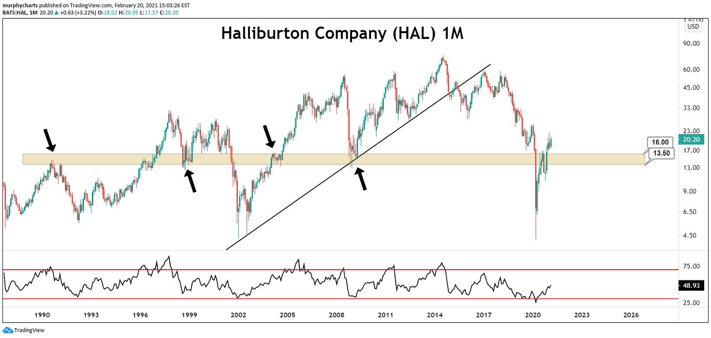
Haliburton Co. (HAL)
Support/Resistance zone between $16 and $13.50 adheres to the principle of polarity i.e. past resistance becomes future support. This zone enables us to better manage risk and place well calculated stops.
The stock is trading above its June 2020 high. You cannot say this for all of the stocks in the Energy sector.
Performance laggard over the past several years.
Total Return 3Y: -54.39%
Total Return 1Y: -5.76%
Chevron Corp (CVX)
Stock remains below its June 2020 high.
~$105 per share is a significant zone.
Weakness since March ‘20 relative to the sector as a whole, despite having one of the strongest balance sheets and being the 2nd largest holding.
Hess Corporation (HES)
Downtrend line (3 touches) going back to June 2008 high.
~$32.50 is behaving as a strong level of support, however the # of touches should worry any bull.
Consistently outperformed the sector for the past 3 years.
Not the best risk/reward set up. One should feel more comfortable trading above $75 per share to the upside or below $32.50 to the downside. Big range I know, but short-term and long-term trend direction varies.
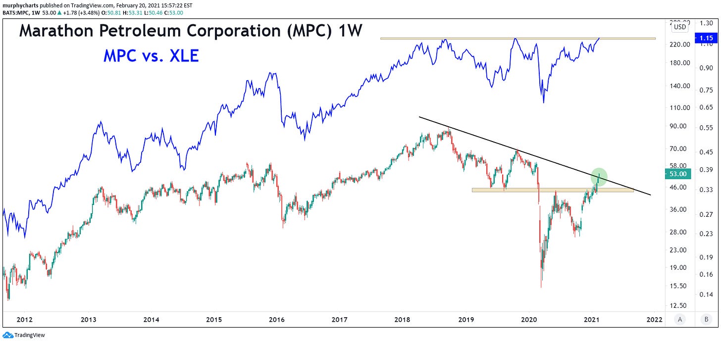
Marathon Petroleum Corp (MPC)
Stock is making noteworthy moves on both an absolute and relative basis
One of the strongest 5yr Total Return numbers in the sector: +103%
Diagonal breakout is notable
Trading above June 2020 high
This is one of the most bullish Energy charts I’ve come across.
The overall technical view of the Energy sector is very middle of the road. Until legitimate long-term price levels are penetrated, it is difficult to be overly bullish on the sector. The sector made new year-to-date highs this week, but the longer-term view is still trading within a robust downtrend. Keep in mind if you bought Energy just 3 years ago, you’re currently down -20%.
Disagree? Let me know!
SM


