


Are We There Yet?
“Data! Data! Data!” he cried impatiently. “I can’t make bricks without clay.”
- Arthur Conan Doyle, The Adventure of the Copper Beeches
S&P GSCI
Commodities continue higher, trading above the March high-low 0.618 Fibonacci retracement level. More notably, the index formed a new weekly closing high.

S&P 500 Index (1/3)
On May 25th, the S&P 500 Index printed a bullish engulfing candlestick. Alone this datapoint may not mean much, but coupled with other factors, it is extremely noteworthy. #weightoftheevidence

S&P 500 Index (2/3)
This week, NYSE Upside Volume exceeded 80% for three consecutive days. Mark Ungewitter put together the below chart outlining past occurrences.

S&P 500 Index (3/3)
Despite several bullish datapoints, one area that is yet to confirm a legitimate market bottom is short-term moving average breadth. The % of S&P 500 stocks trading above the 20-day moving average failed to close >90% on a weekly timeframe. It is important to note, the index saw this breadth indicator exceed 90% but only on a daily timeframe.

Nasdaq 100 Index
The tech heavy Nasdaq 100 Index reached oversold in terms of moving average breadth as the % of NDX stocks above the 200-day moving average crossed below 20% the last week of April. The index stayed below 20% for the first few weeks of May, but is now back above, closing the week at 24.50%. Historically, this area has marked a near-bottom in the index.

Corporate Insiders
The below chart, provided by JP Morgan Equity Macro Research, tells a story of insider buying > insider selling. It appears S&P 500 insiders are buying into the recent market decline.

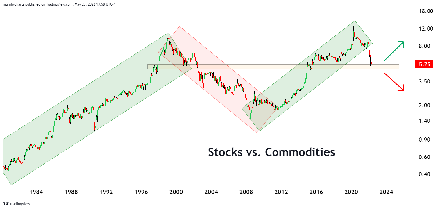
Stocks vs. Commodities
Investors are hiding out in commodities. It’s worked in this environment, but the below ratio is at an inflection point. A breakdown below the highlighted zone would be additional evidence that a prolonged stretch of outperformance from commodities is in the cards. In recent months, many technicians have pointed out that this relative trend is rarely short-lived, and typically persists for many years.
US Dollar & Energy
The energy sector has seen its best two year stretch in quite some time. Energy commodities typically carry an inverse relationship with the US Dollar, given the commodities are priced in USD. Despite the US Dollar Index outperforming both stocks and bonds year-to-date, energy companies continue to have their time in the sun. The S&P 500 Energy Sector is +61% YTD.
The US Dollar Index is at a critical level, indicating a potential pause to its upward move. Should we expect a declining US Dollar Index to aid energy companies in the short-term? History would say so…

That’s enough out of me. Happy Memorial Day Weekend - thank you to the brave men and women who have made the ultimate sacrifice. We don’t know them all, but we owe them all.
“Where liberty dwells, there is my country.” - Ben Franklin
SM
All indices are unmanaged, and investors cannot actually invest directly into an index. Unlike investments, indices do not incur management fees, charges, or expenses. Past performance does not guarantee future results.
Thanks for the update 🍀