
A Story in Four Charts
US High Yield Bonds vs. US Small-Caps:

Small-Cap stocks - synonymous with lottery ticket, illiquid, low quality etc. The asset class has underperformed high yield (below investment-grade) bonds year-to-date. However, the ratio is coming into a significant support/resistance zone. This chart is intended to help gauge investor risk appetite.
Emerging Market Equity vs. Global Equity:

Nothing new here. But still one of the most viewed charts on my watchlist. The weekly 14-period RSI continues to form higher lows whilst the ratio forms lower lows. Bullish divergences can and do resolve to the downside. On their own, a divergence is no reason to stick your neck out and attempt to time a trend change!
Replace EM equity with any Non-US equity index denominated in USD, the story is the same. The US Dollar is not messing around! The FTSE UK 100 Index (priced in GBP) is down only -5.33% year-to-date. But a product that tracks said index priced in USD, is down over -18%. Ouch.
If the dollar begins to weaken and stocks respond positively, we may find ourselves in a regime (however long) where Non-US stocks outperform US stocks. This would make sense, especially if Value continues its dominance over Growth. Something to think about the next time you hear “you do not need to own Non-US stocks” in your buy & hold portfolio.
US Corporate Bonds vs. US Stocks:
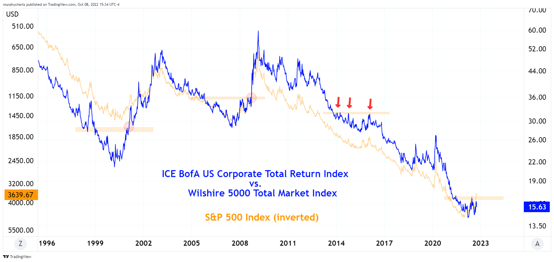
Ah, another chart to assist in gauging risk appetite. If it’s bonds > stocks, the above ratio will form new highs. Although stocks have closed below their June lows, this ratio is yet to surpass its June high (note: SPX scale is inverted). I find this notable and view the ratio as potential confirmation of the downtrend in stocks.
Commodities vs. Stocks:

It’s been noted that when commodities are outperforming stocks, it doesn’t just last a year or two. It can last quite a long time. The above chart goes back to the early 1920s. It’s clear, the primary trend is down e.g. stocks > commodities. However, in 2022 commodities have been one of few areas displaying positive return. The asset class makes for a great portfolio diversifier. Commodities remain non-correlated to equities and are worth understanding!
There you have it. Four charts to help us digest the volatile year thus far in financial markets. What charts are you keeping an eye on? Let me know!